Using All of the Senses
- Stella De Genova
- Feb 14
- 2 min read
Blind Artist Vision: blog by Stella De Genova
When I was younger and my vision was fairly decent in good lighting, I relished going to the Art Institute of Chicago, taking my time finding my favorite paintings and just being with them. It was always fun to stand or sit in front of a painting and think about style, colors, brush strokes and feel the mood (this is what an artist considers fun!).
Mostly, we use our eyes to look at a painting. This obviously becomes a disadvantage to a blind person. Or is it? With impaired vision, it is certainly harder to “look” at things just using sight so, naturally, our other senses take over to assist. First, a reminder that about 85% of blind people have some level of sight while about 15% are totally blind. Even for a completely blind person, a sighted guide can describe a painting and this still makes for a fulfilling experience. A good description should not only include visual terms but also the mood, temperature, size, and movement of a painting.
In my case, I still have 15-20% of my vision. I cannot appreciate the colors and painterly brush strokes anymore, but in my own blurry way, I enjoy the contrast of shapes and placement. When I discover a reference photo that I want to paint, I like to take the time to sit with it and put myself into the image. This is a good time to put other senses to work.
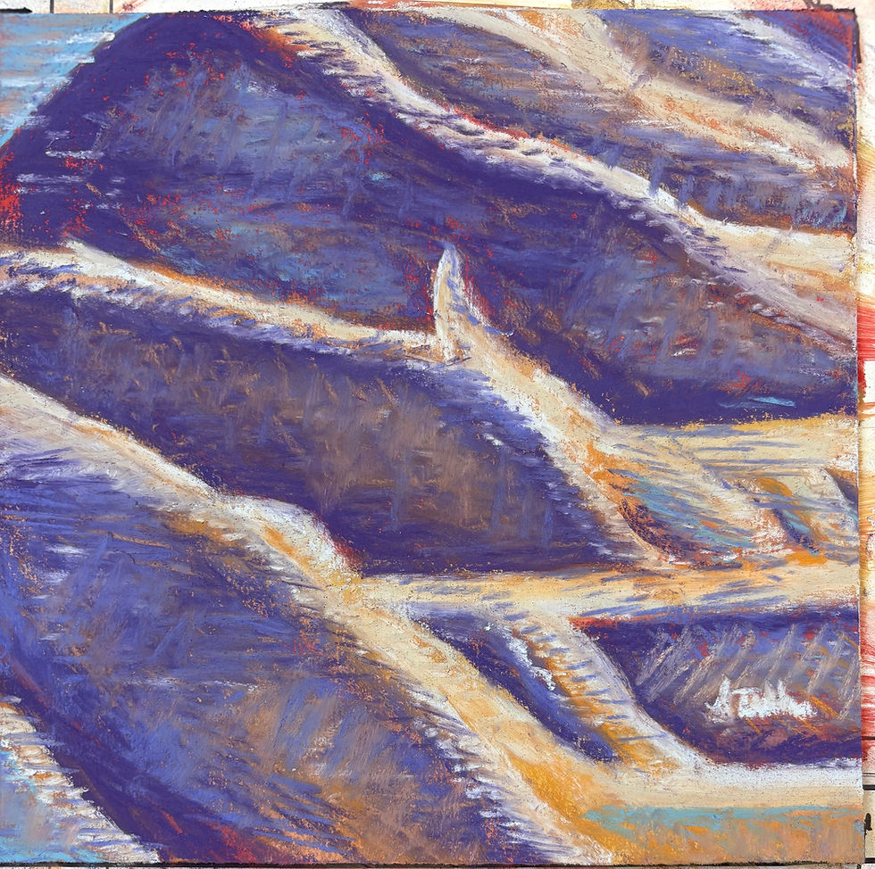
In this current painting, I first fell in love with the contrast of dark and light colors in the photograph. As I took a more serious dive, I saw the contrast of soft yet strong flowing waters against sharp jagged rocky hills. I can hear the water hitting the rocks and I can smell the sea air. Even in the midst of rushing water, it is quiet. I’ve put all of my senses to work to better understand this moment in time and nature.
Although my failing vision doesn’t let me pick the most correct and realistic colors anymore, my other senses help me step into this place that will become my painting. For me, the paintings that I connect with most come from a place where I can use all of my senses to create a moment in time.
For my painting, Hong Kong Waters, I used purples and grays for my underpainting. Whichever colors I chose to use next in my layering – oranges, yellows, purples, blues– I mostly wanted to keep the high contrast of the darks and lights. Many people ask how I can still paint when it’s so difficult to see in daily life and I think it’s the darkest of darks and the lightest of lights that bring my images into focus, both in my life and my paintings.


Comments